Exploring PurpleAir: What the Data Means
What the Data Shows Us:
Increases in the concentration of particulate matter in the air can mean a few different things. Air particles can be carried from one place to another by the wind or when a strong front moves it. The opposite also has an affect on air pollutants; the particles could remain stagnant in one location. Heat waves typically lead to poor air quality due to the air not moving.
-
During the winter months, the air seems to be hazier. This is due to pollutants caused by wood burning, idling cars, and chimneys.
-
In the summer, when there is lots of sunlight, this extra light leads to the production of harmful ozone and additional particle pollution in the atmosphere.
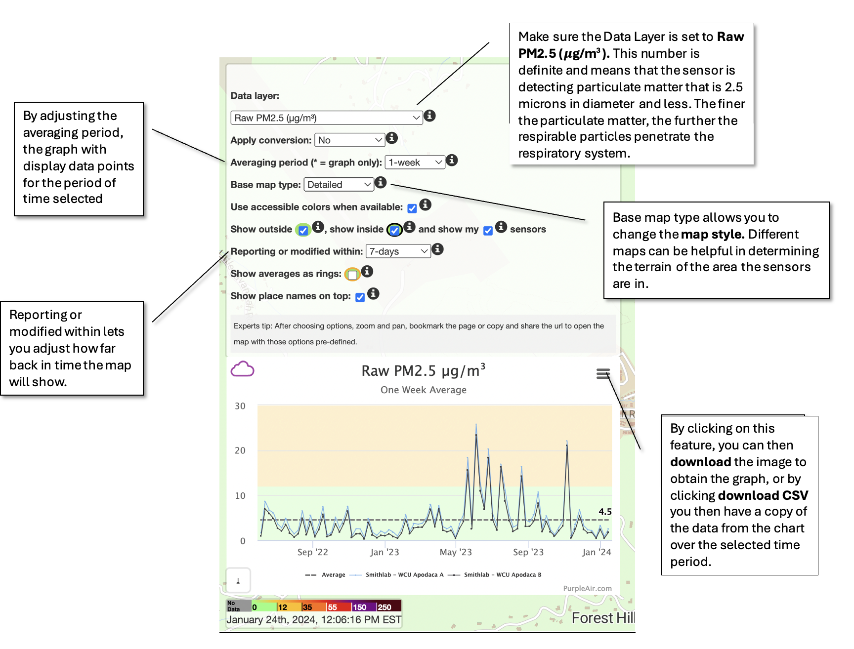
All of these factors can lead to elevated levels of particle matter, which can be seen through exploring the graphs on the PurpleAir Website.
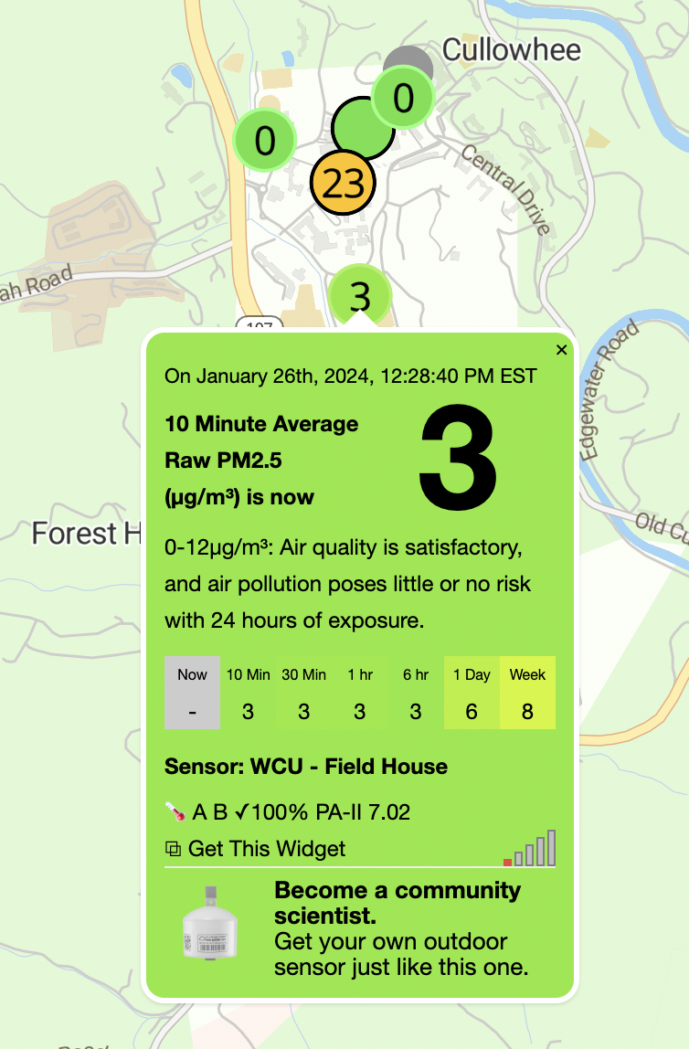
Below is a step-by-step guide on how to use the map and read the graphs:
-
select an air quality monitor on the PurpleAir Map, click on the top of the graph to display different settings


